The French company Peugeot, which is part of the newly formed mega-group Stellantis, has announced a change in logo and corporate identity.
The new emblem is a heraldic shield, inside of which there is a large image of a lion's head with an aggressively opened mouth and the name of the brand in a sans-serif font. In other words, the predator is now drawn not in full growth. The color of the shield is black, the drawing applied to it is white.
The new is the well-forgotten old. The main decisions of the Peugeot emblem of the 2021 model repeat the logo of the brand of 1960, only the graphics of the pattern have become more strict and expressive, and the colors have been inverted. The lion's head is associated with many of the most successful Peugeot models of the past, including the 404.
It is noted that the emblem is flat, thanks to which it will be convenient to hide video cameras and radars of the autopilot system behind it.
According to the plan, such a brand name will make Peugeot more recognizable, because few modern cars use a logo shield.
Recall that the emblem of the outgoing sample is a voluminous silver lion in full growth and without a frame, such a sign has been used since 2010.
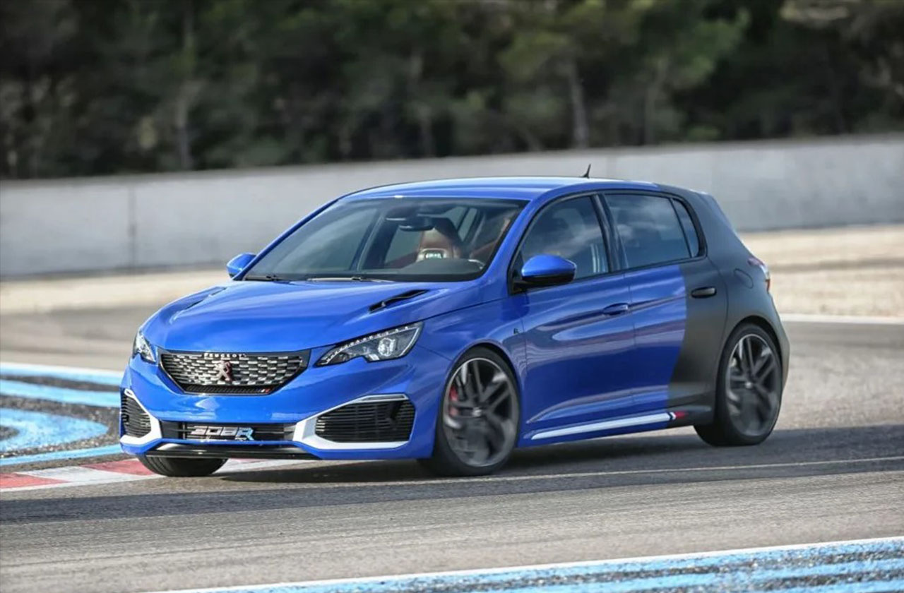
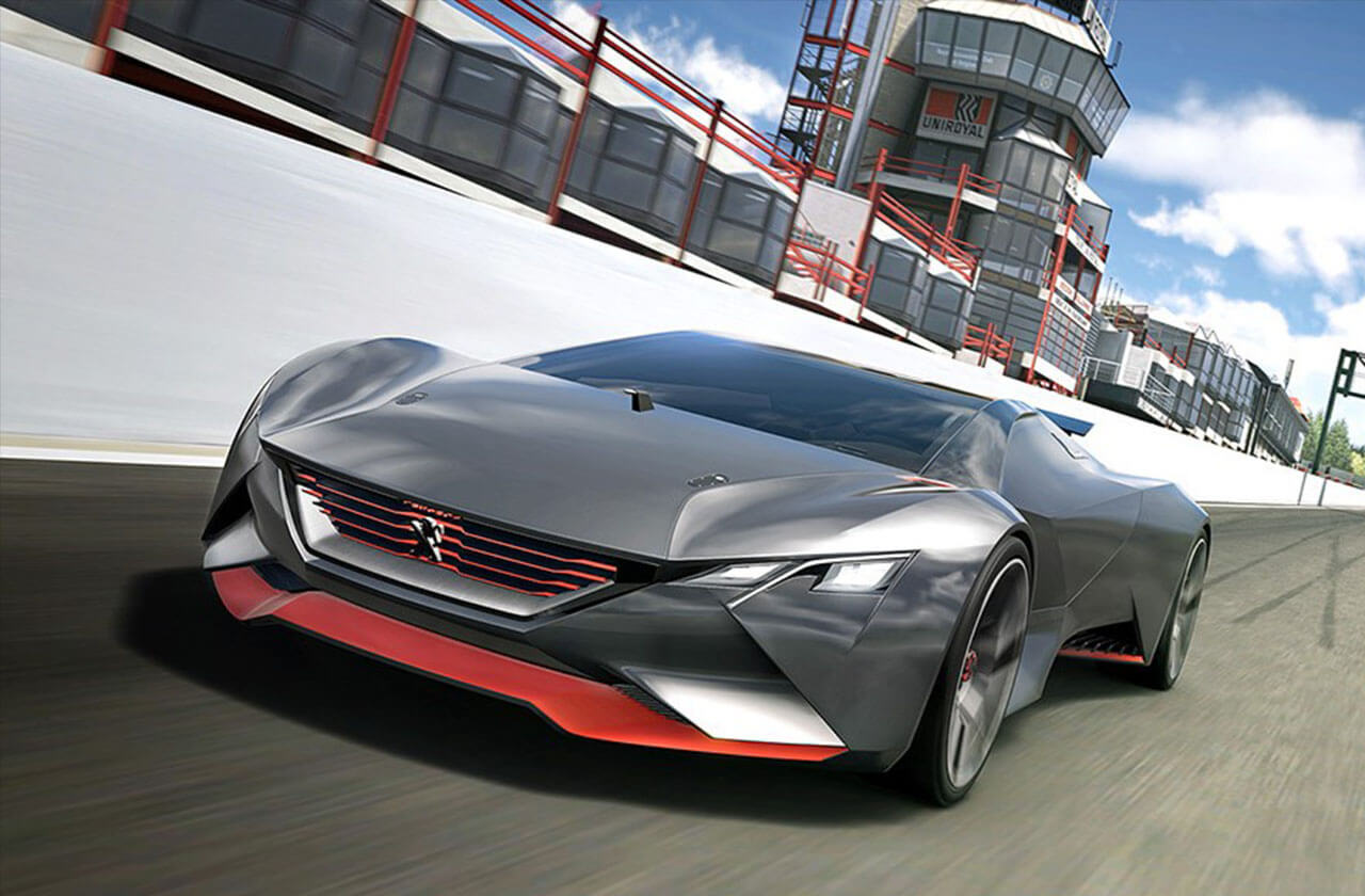
The first production car to receive the new "lion-headed shield" will be the next-generation 308, which will be unveiled on March 18. Gradually, the logo will be extended to other models of the brand. But in general, this emblem could be seen on the Peugeot e-Legend concept car almost three years ago.
Then the identity change will also affect car dealerships - a standard solution for the exterior design of dealerships has already been developed. It involves painting the building in dark blue and using a "shield" in conjunction with writing Peugeot in the company's font.
Peugeot has changed the logo: the lion is now angry