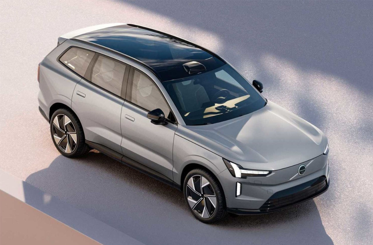
Volvo Cars has updated its corporate logo - in accordance with the latest trends, it has become flat and monochrome.
The new Volvo Cars symbol, officially called the Iron Mark, has a two-dimensional design in black and white. The logo is completely devoid of the 3D effect that Volvo has been using since 1999.
The ring has become thinner, besides, it is interrupted at the exit point of the arrow. The horizontal strip that served as a background for the inscription also remained in the past. Now the name Volvo "hangs in the air."
Volvo brand emblems trace their history back to 1927, when the first model of the brand was released. Even then, on the radiator grill there was a ring with an arrow looking to the right and up. It is both a symbol of iron, the Roman god of war Mars and masculinity. The Swedes chose him for a reason: he is well recognizable in the Scandinavian and Vedic cultures.
From 1927 to the present time, the Volvo logo has been transformed several times, but has always remained recognizable.
The company has already started using the updated symbol on social media. In 2022, it will come to dealership signage, and then to the cars themselves.
Volvo trucks are not affected by the logo change.
Volvo cars will now have a simplified logo