Citroen succumbed to the trend - and changed its corporate logo. Recall that in recent years, auto brands such as Volkswagen, Skoda, Volvo, Renault, Dacia and Peugeot have already changed their own symbols.
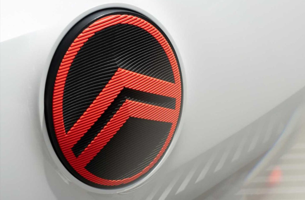
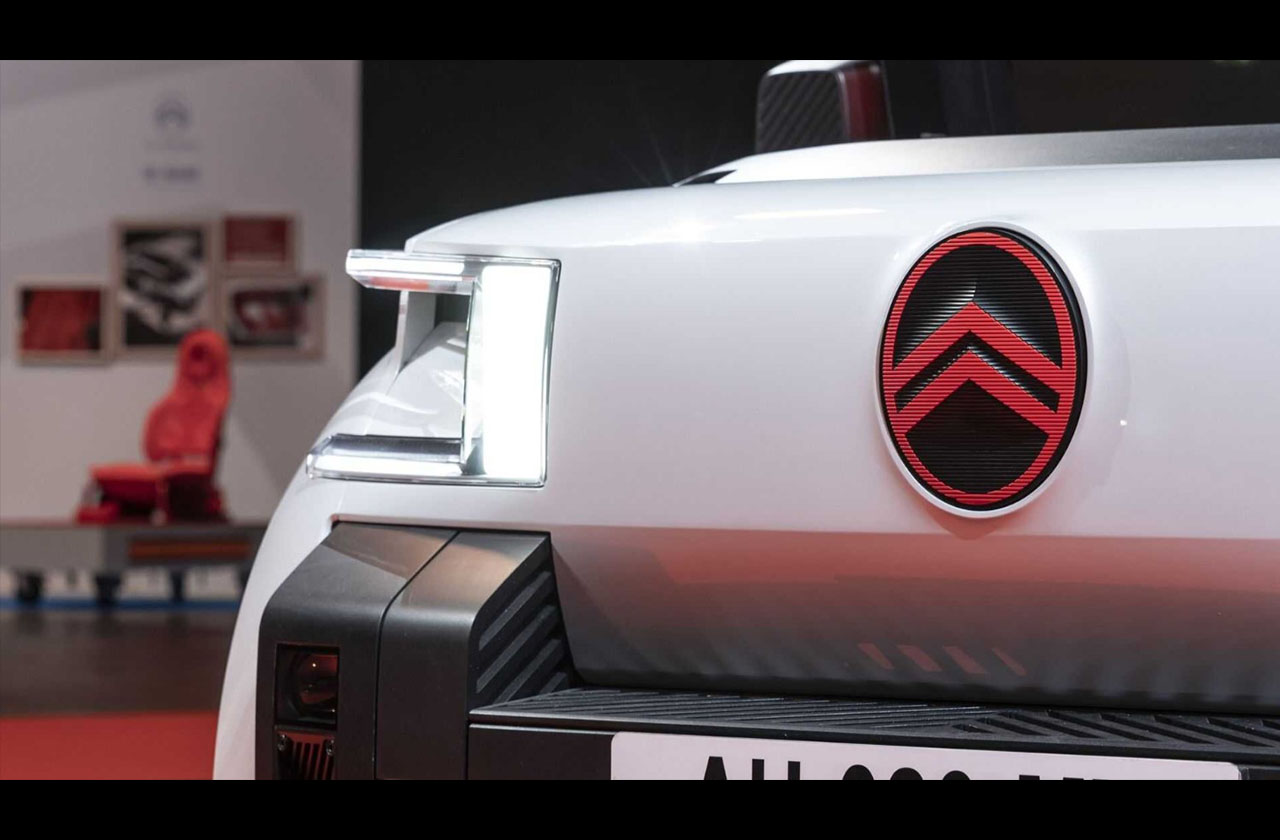
The new Citroen logo retains two traditional chevrons, but from now on they are placed in a vertical ellipse, under it is the name of the brand in a corporate font. In fact, Citroen returned to its roots - its first emblem of the 1919 model. However, relative to the historical sign, the proportions have been changed - the chevrons are larger and bolder, in addition, the logo is monochrome black (in printed version).
By the way, a similar logo has been used by the Chinese bus manufacturer Golden Dragon for more than 15 years, but its chevrons are placed in a circle. Golden Dragon has nothing to do with Citroen.
The last time Citroen updated the logo in 2016, then in the graphic version it lost its color and chrome effect.
The current version of the emblem is the 10th in the history of the French automaker.
On cars, the emblem will be used in red and black colors.
The new logo is used in dealerships, on the official website, in promotional materials, on the headquarters building. It is expected that already in 2023 the cars will change the badge.
Recall that Citroen is part of PSA, which, in turn, is part of the Stellantis concern.
Citroen returned its logo to 103 years ago